DSP GROEP
Variable identity design; a growing window to future solutions
Consultancy and research focused on social issues
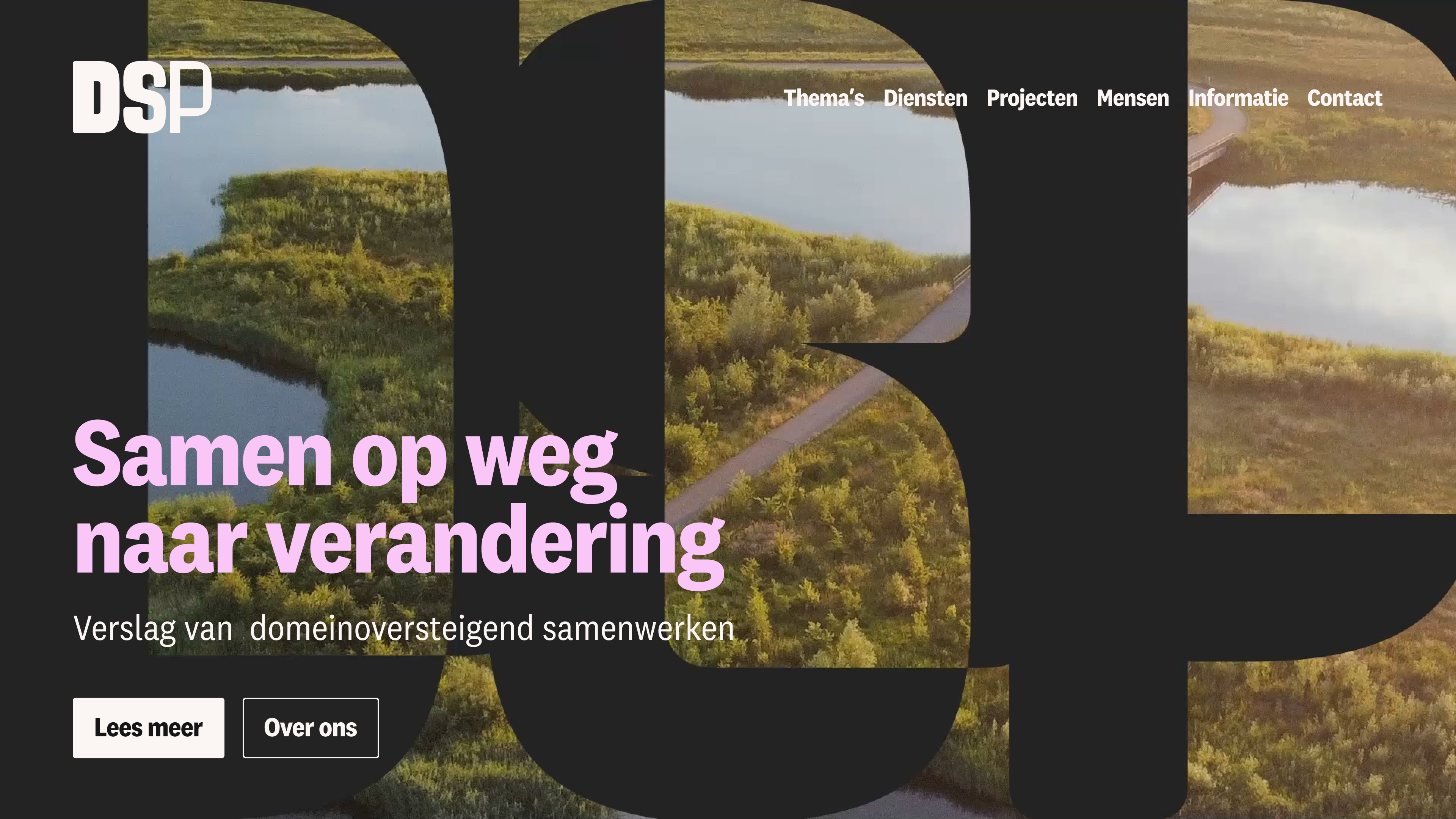
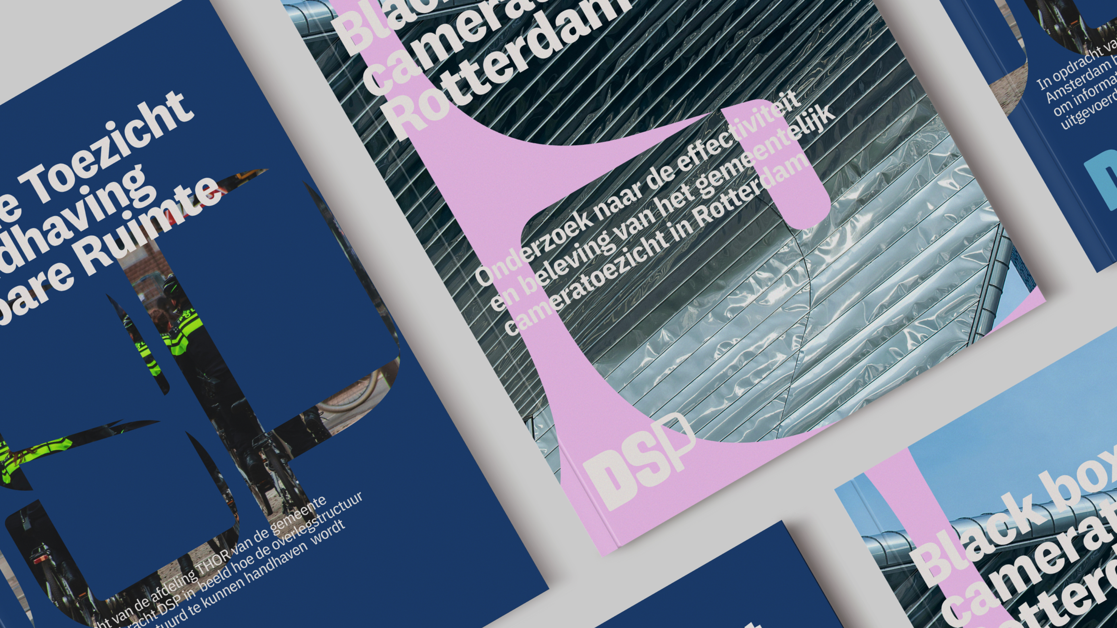
DSP Group is a Dutch consultancy and research agency focused on social safety, health and healthcare, and the public domain. Through policy research, strategic advice, and hands-on project support, they help organisations to develop, implement, and evaluate well-founded policies. Their approach combines analytical depth with years of practical experience — translating complex societal questions into clear, workable solutions for the future.
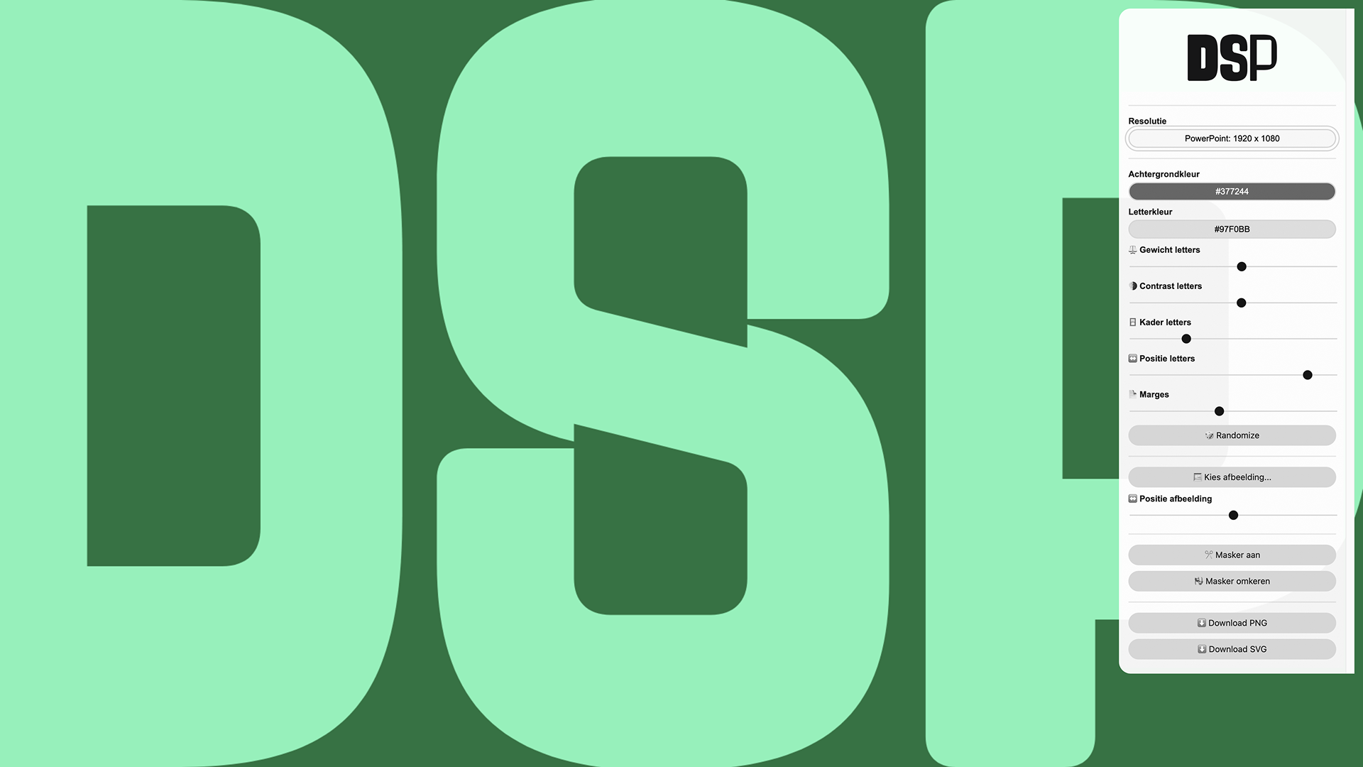
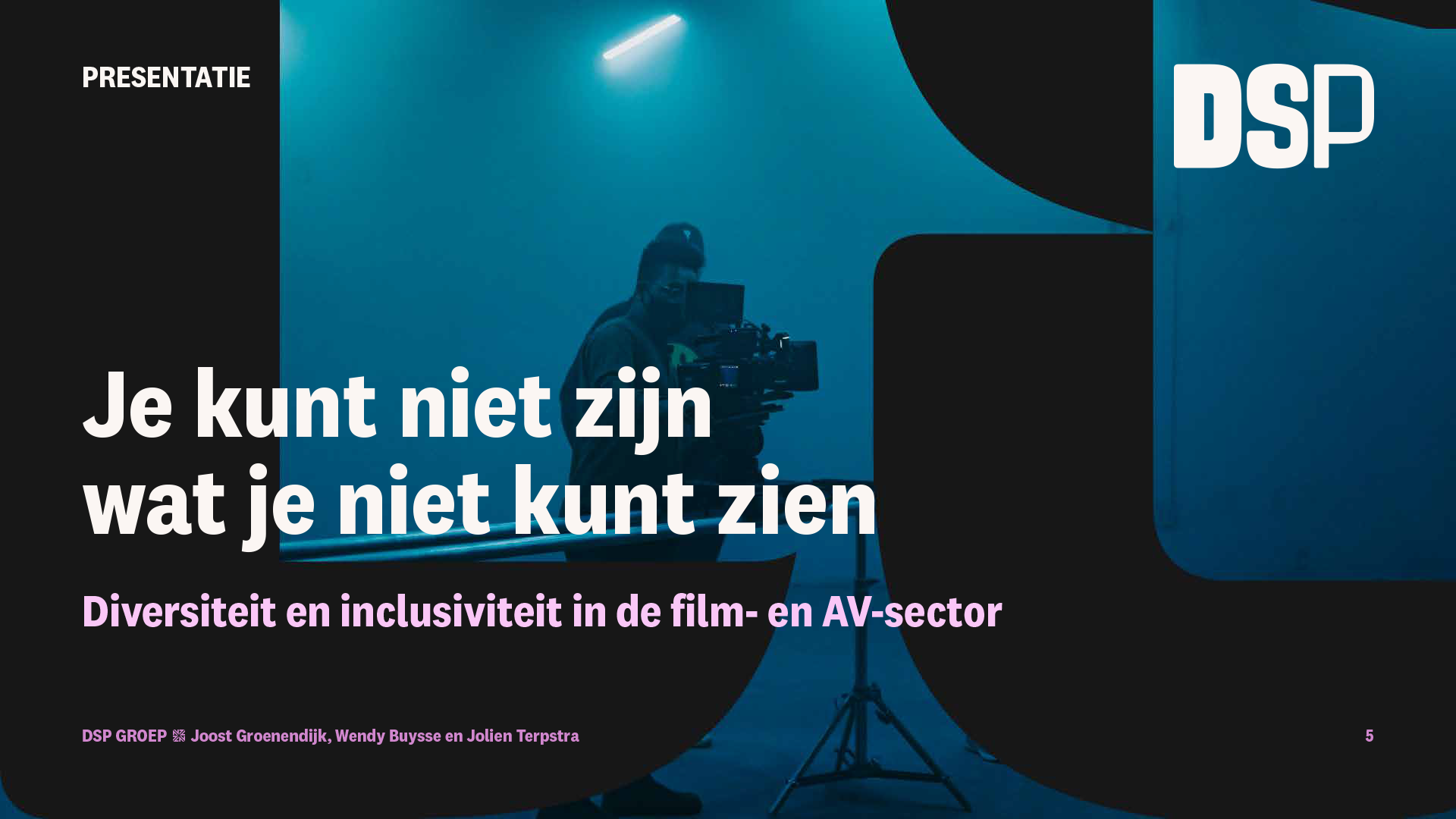
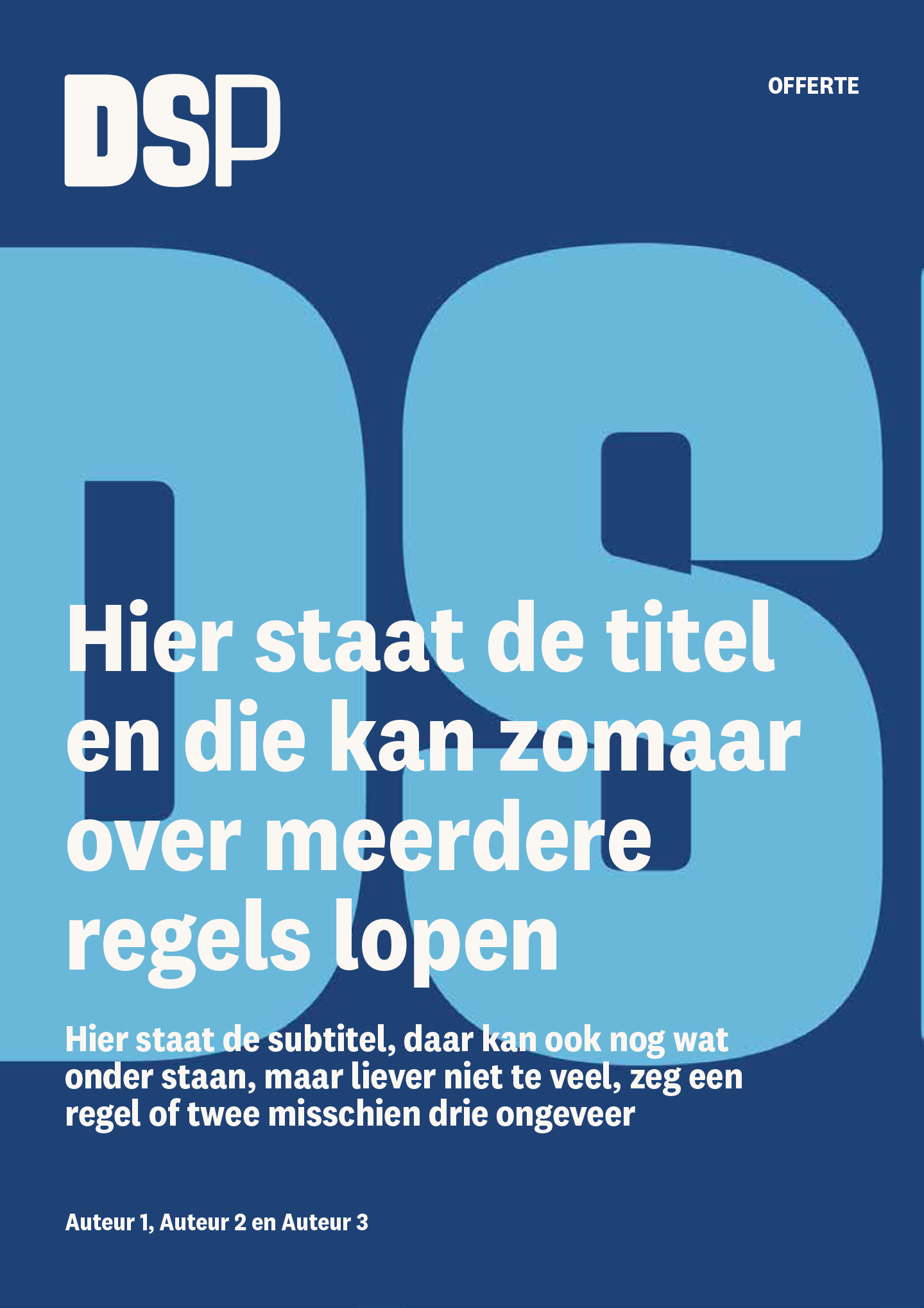
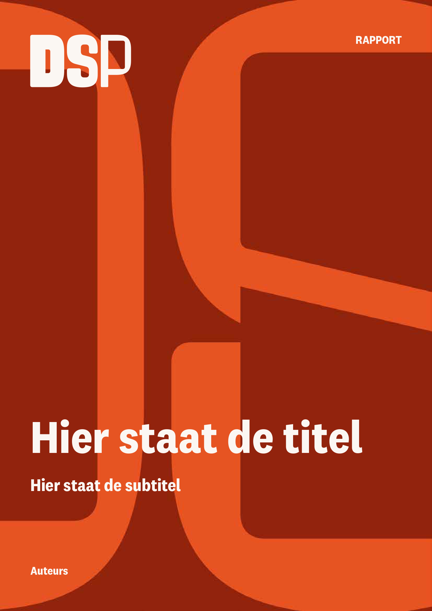
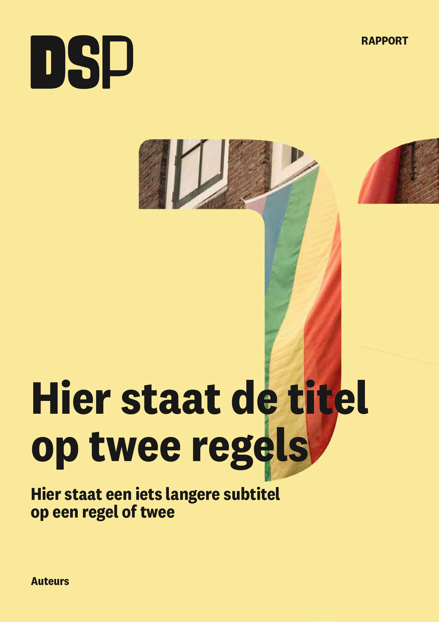
Multitude was asked to develop a new identity for them, something that shows their view and focus towards solutions and the future, but also someting that translates well to a large number of applications (since they publish a lot of publications and presentations), and works well across static and application in motion.
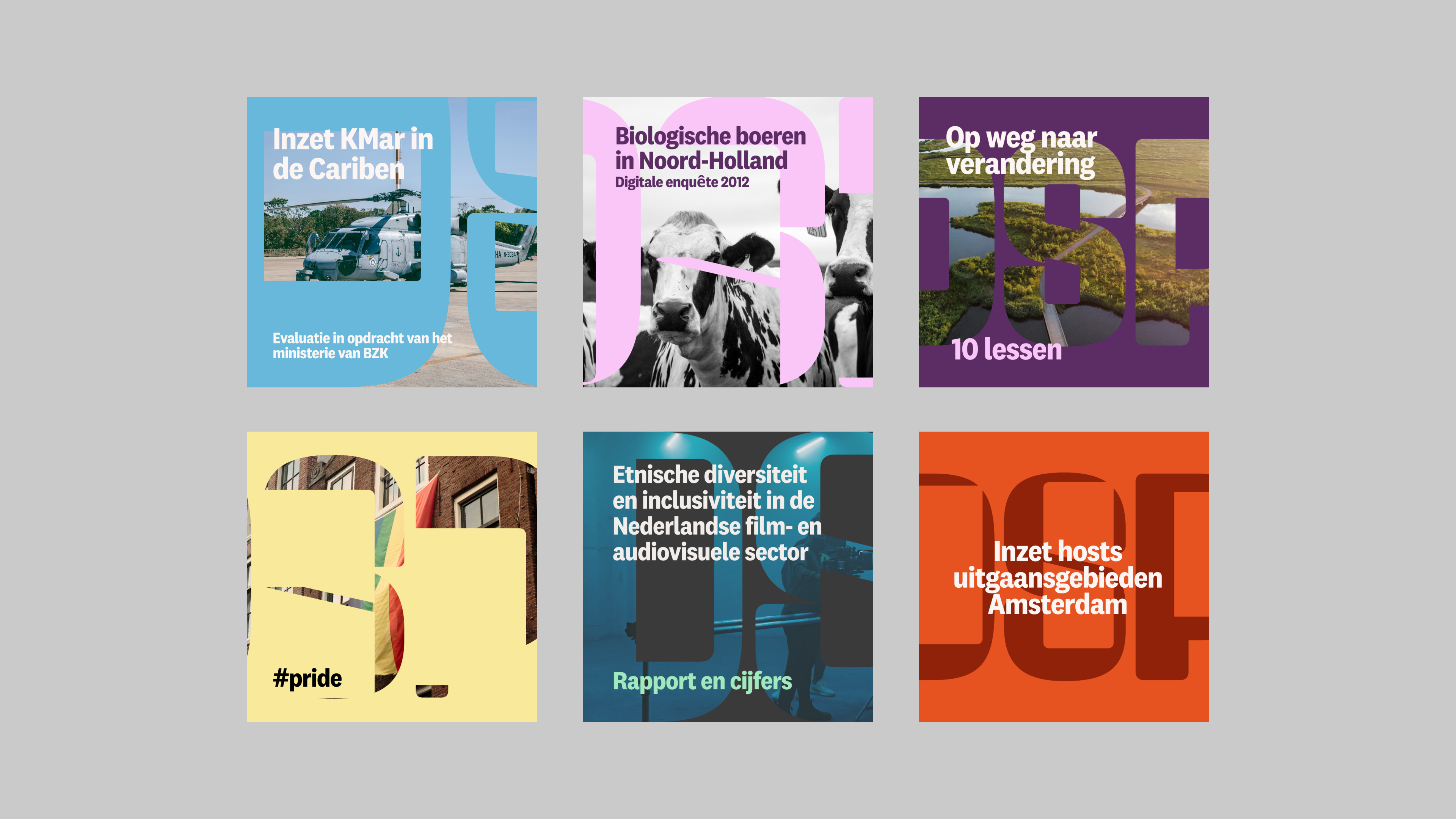
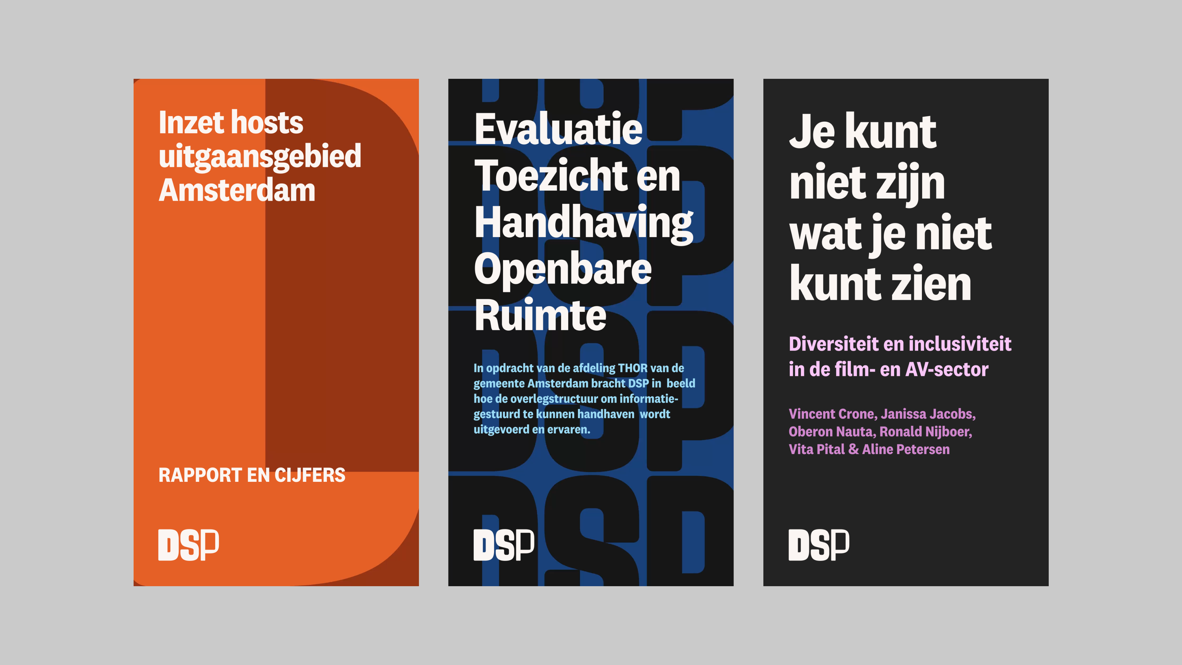
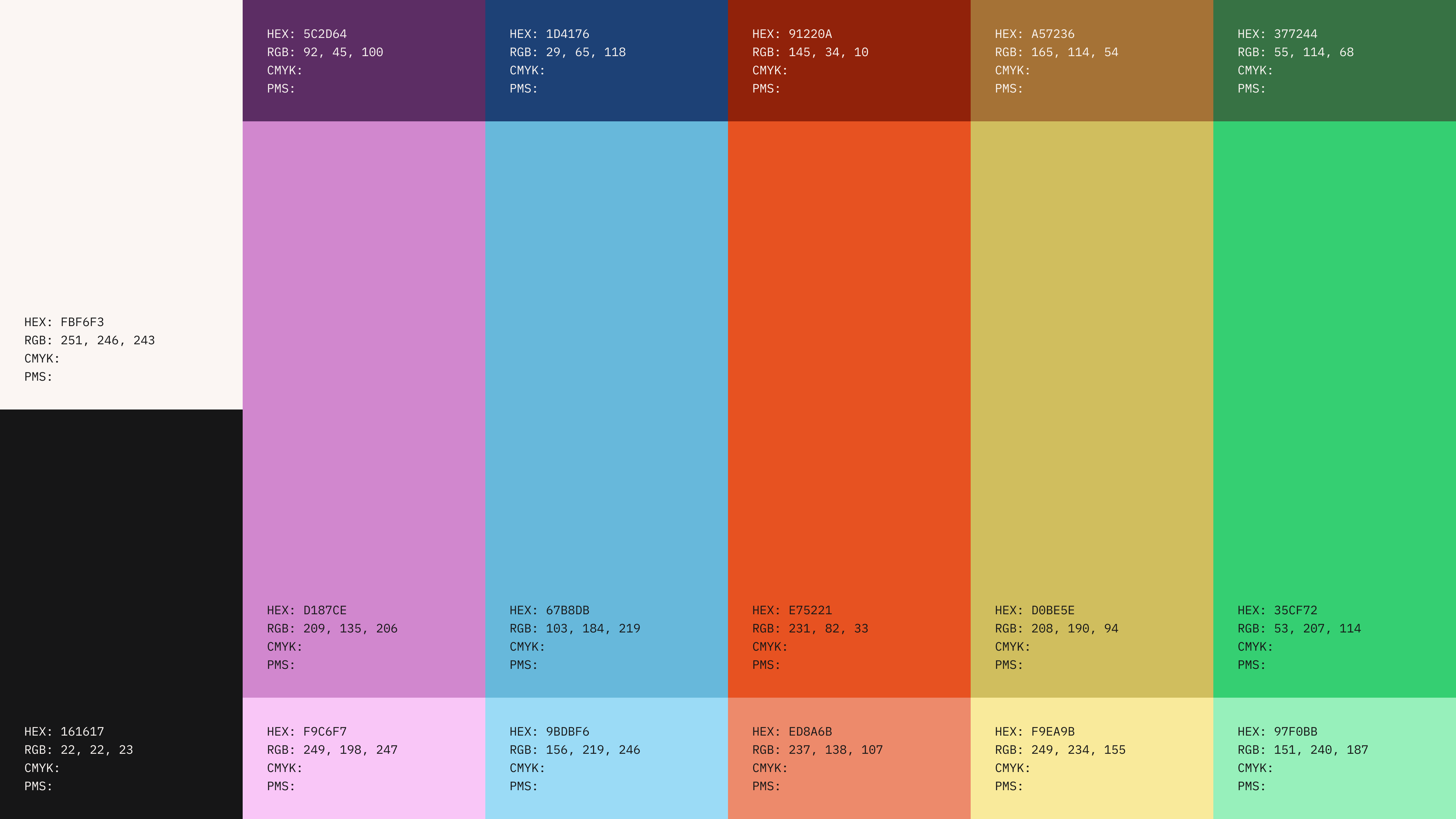
Paradigm shift
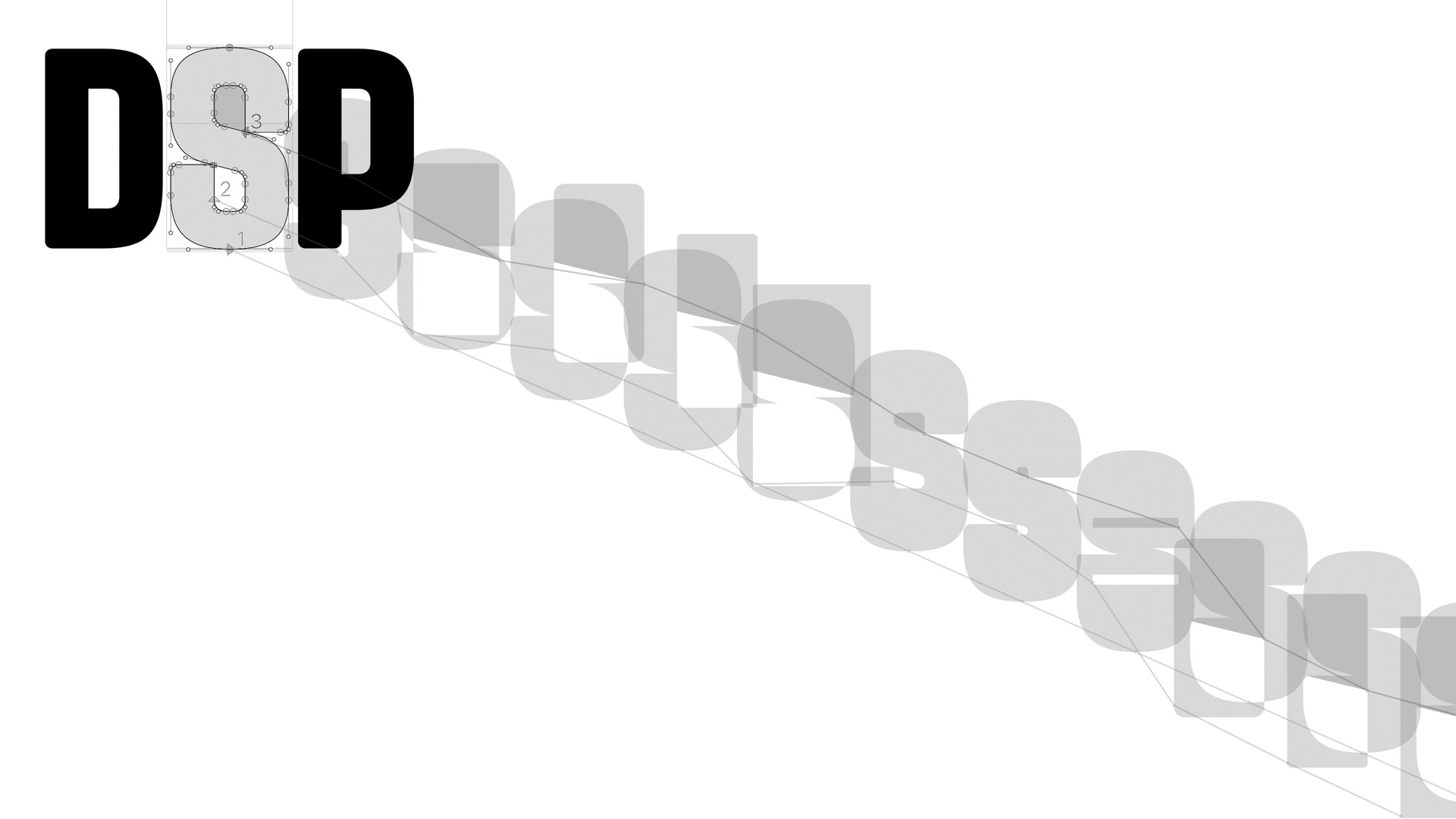
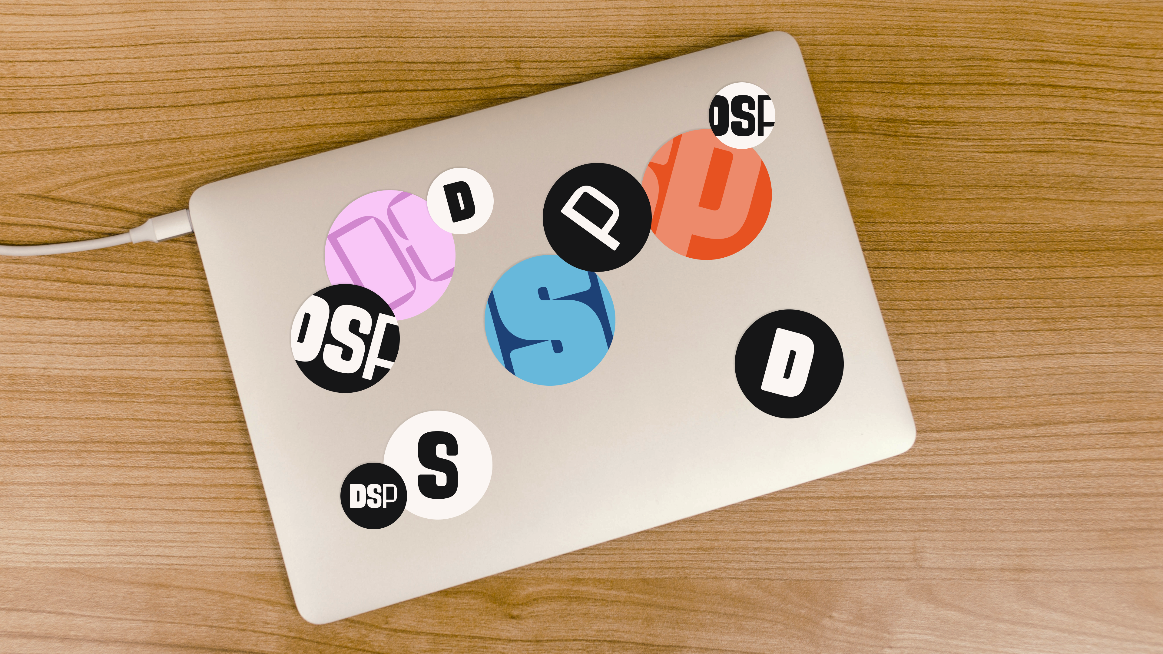
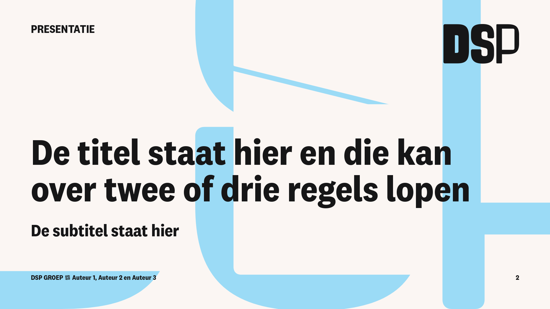
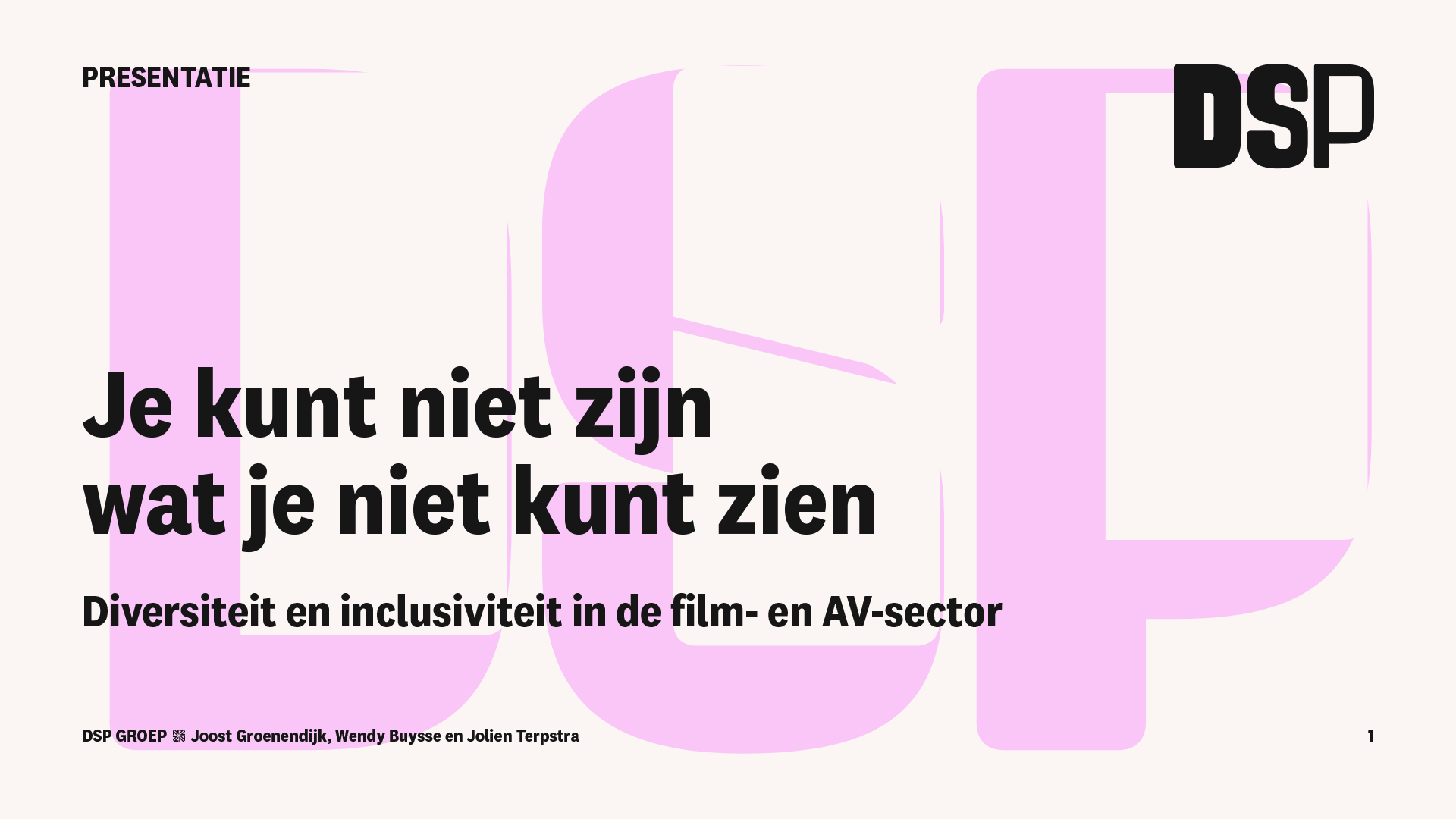
Starting from notions of perspective, space and a different point of view, the concept of a shifting paradigm (or a growing window) was developed into an identity design with a visual language that is able to shift, adapt and grow as well.
Using shape and countershape of the letterforms as literal windows, we developed both a static logo, and a variable version version of the logo aimed at motion and generative design for various applications.
In collaboration with Andrea Vendrik (concept) and Aidan Wyber (programming).
Fonts used
klim.co.nz/fonts/national-2-narrow/